Vlak voor de grote tsunami was ik op vakantie in Sri Lanka. Tijdens een van mijn wandelingen door het stadje Tengale aan de zuidoostelijke kust zag ik in een winkeltje enkele schoolspulletjes liggen waaronder enkele leerboekjes voor het Sinhalees. De letters waren prachtig maar voor mij totaal raadselachtig. Ik wist dat het die taal was en dat het een leerboekje was. Dat het Sinhalees was en dat het vertaald kon worden. Mijn vraag op dat moment was, hoe ziet een schrift er uit dat een volkomen raadsel is voor een westerling. Dus niet een schrift dat vertaalbaar is. Het wekt slechts de indruk van een schrift maar verder dan die indruk gaat het niet. Betekenis, functie en doel blijven totaal onbekend. Alsof het van een andere planeet komt.

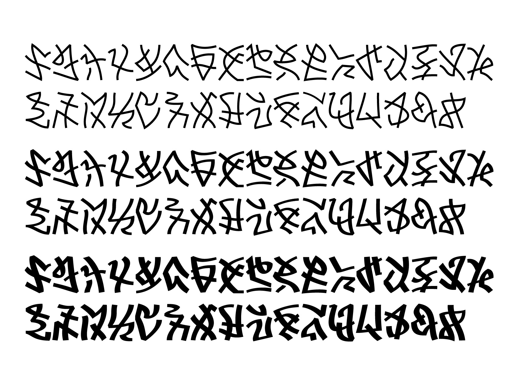
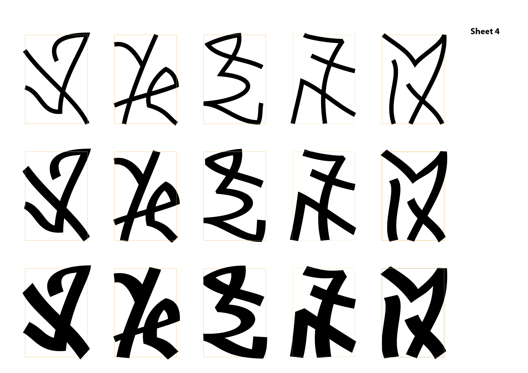
Met deze intrigerende vraag in het achterhoofd ben ik begonnen om een schrift te ontwerpen dat een volkomen raadsel is en blijft. Wel moeten de letters de stellige indruk wekken een schrift te zijn. Verder gaat het niet. Wel heb ik een poging gedaan om esthetische eisen die wij respecteren in een letterontwerp, na te volgen. In het ontwerp is een kalligrafische basis waar te nemen. In woordvormen en regels heb ik geprobeerd om een gelijkmatige spatiering te behouden. Verder is het met name een exercitie in schoonheid. Er is immers verder niets waaraan mijn ontworpen schrift hoeft te voldoen.
Het zijn er ook meer dan 26 en het zouden er ook 1000 kunnen zijn. Een letter zou immers ook een andere vorm kunnen krijgen door de invloed van de letter ervoor of erna. Een beetje zoals Arabisch. Het zijn er 33 geworden.
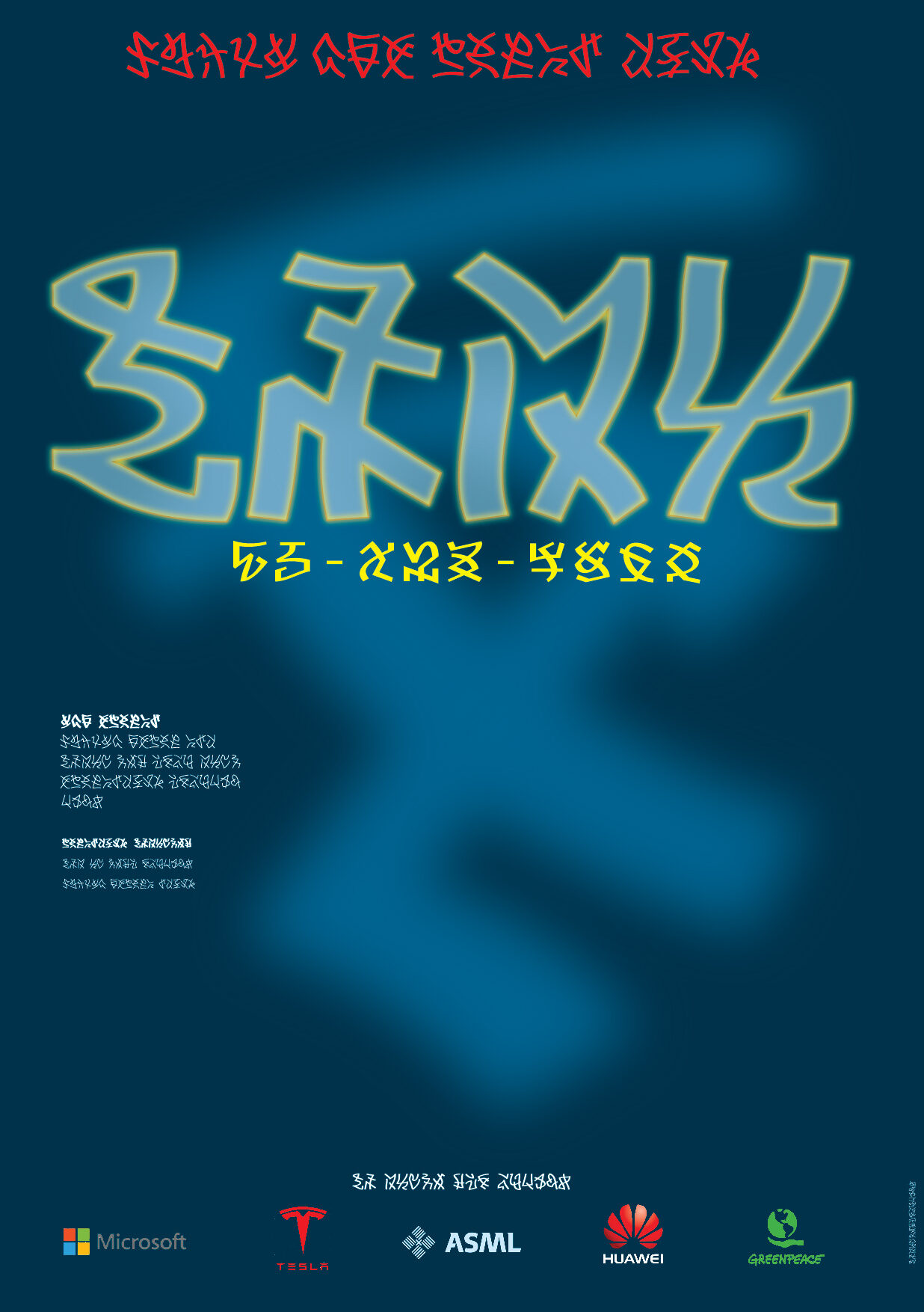
Mijn bedoeling is om ook tabellen en diagrammen te maken en ook posters en zo. Hierbij ook alvast een poster. Wat daarop wordt verkondigd weet ik niet.