Opdrachtgever: Ptt Post
Producent: Johan Enschedé
Ontwerp & uitvoering: Jelle van der Toorn Vrijthoff
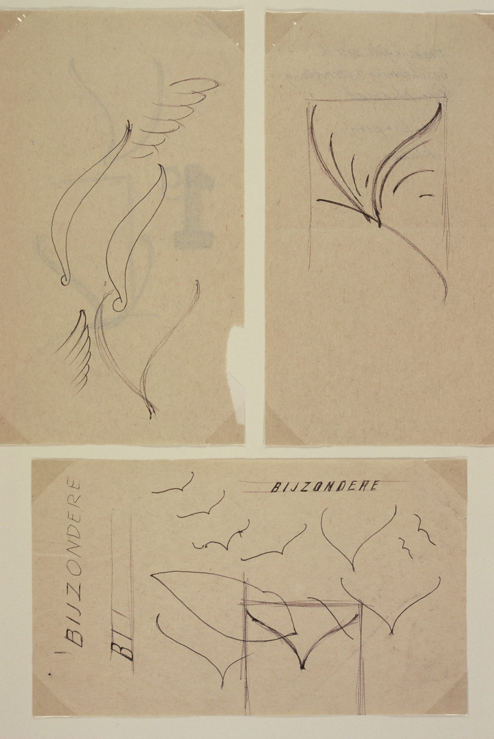
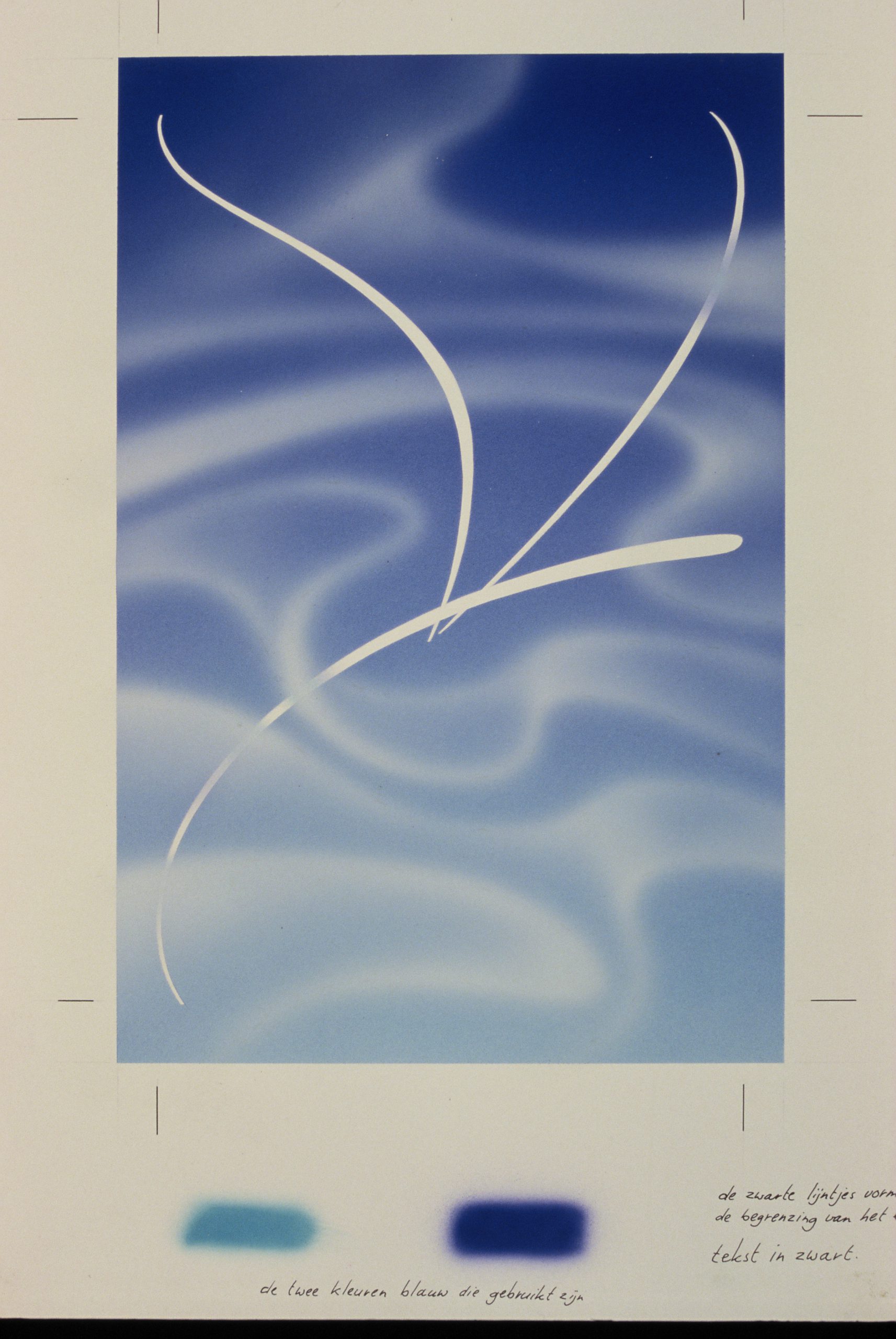
De postzegel voor Bijzonder Vluchten werd en wordt misschien nog steeds elke tien jaar uitgegeven. Over het algemeen kozen de ontwerpers voor figuratieve afbeeldingen van vogels en vliegtuigen en slechts één keer door de mythologische figuur van Mercurius. In een poging om de figuratieve beelden te vermeiden wilde ik een veel abstracter beeld maken. Een beeld dat veel meer de associatie met vliegen op zou roepen.
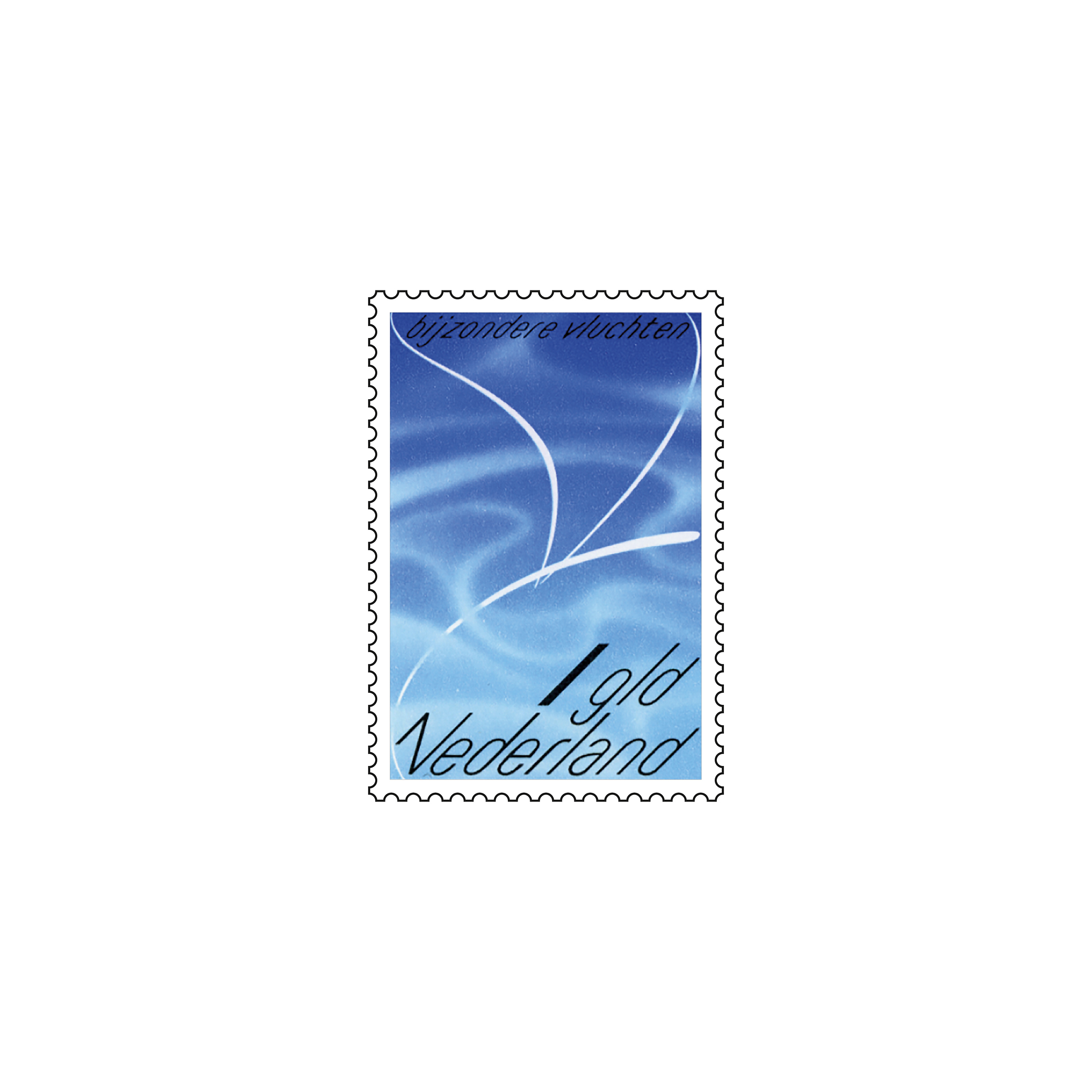
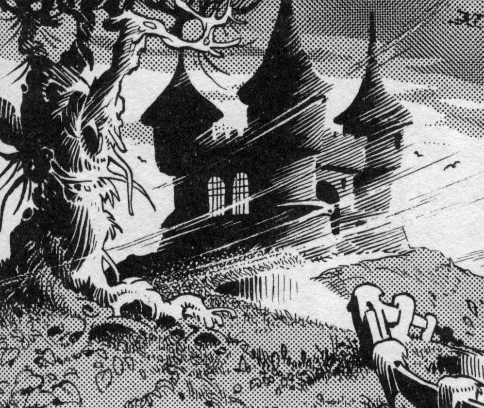
Ik ben een groot fan van de stripverhalen uit de lage landen en vooral de avonturen van Heer Bommel en Tom Poes spraken mij zeer aan. Ik kon mij herinneren dat ik de tekeningen van Maarten Toonder in detail bestudeerde. De manier waarop hij vogels tekende die rond de torens van slot Bommelstein vlogen, was van een indrukwekkende eenvoud en schoonheid. Die simpele penseelstreek was voor mij de inspiratie voor mijn ontwerp.
In die dagen moesten postzegelontwerpen worden goedgekeurd door de Directeur Generaal himself. Ik weet nog dat ik bij hem zat met het ontwerp van de zegel tussen ons in. Hij twijfelde erg en ik zag langzaam de afkeuring zich van hem meester maken. Voordat hij tot die uitspraak kwam deed ik een poging om mijn ontwerp te redden. Ik zei dat elk gewoon mens hierin iets zou herkennen dat met vliegen te maken had. Op dat moment kwam de koffiejuffrouw zijn kamer binnen. Zonder een moment te twijfelen vroeg hij aan haar wat zij zag in de afbeelding. Ze zei dat ze er iets in zag dat met vliegen te maken had, iets dat vliegt. Daarmee was het ontwerp goedgekeurd.
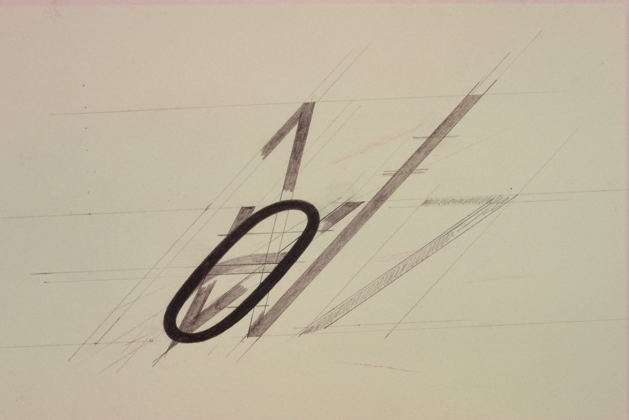
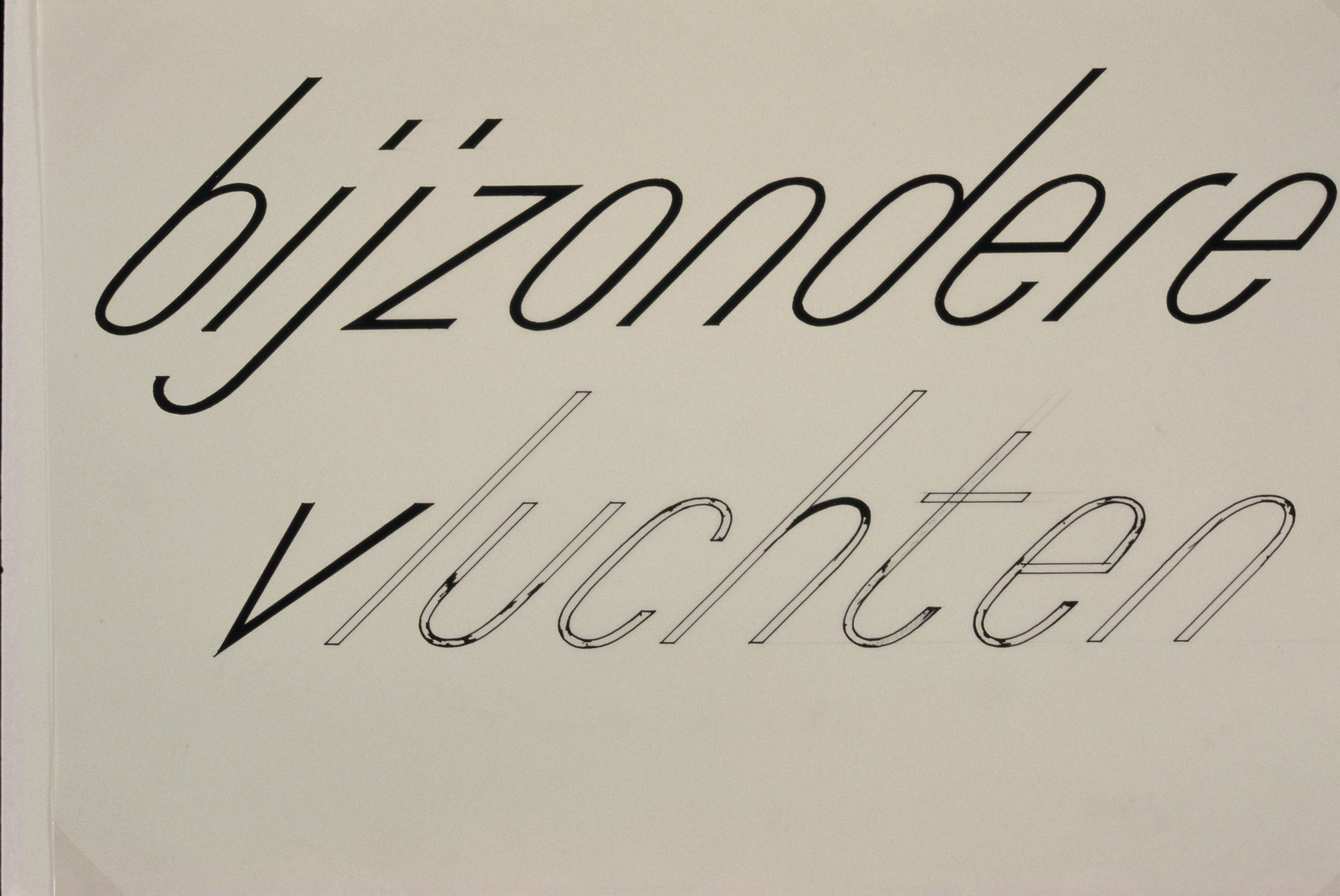
In stijl met de vliegrichting van het object heb ik een passende letter ontworpen. Een zeer eenvoudige cursieve schreefloze onder een hoek van 45 graden.