Opdrachtgever: PTT Post
Productie: Johan Enschede
Ontwerp: Jelle van der Toorn Vrijthoff
In 1985 uitgegeven ter gelegenheid van het vierhonderdjarig bestaan van de Nederlandse vlag.
De vlag van Nederland is de vlag van het land Nederland. Zij staat daarnaast symbool voor de eenheid en de onafhankelijkheid van het gehele Koninkrijk der Nederlanden. Het rood-wit-blauw is zowel te land als ter zee in gebruik als civiele vlag, dienstvlag en oorlogsvlag.
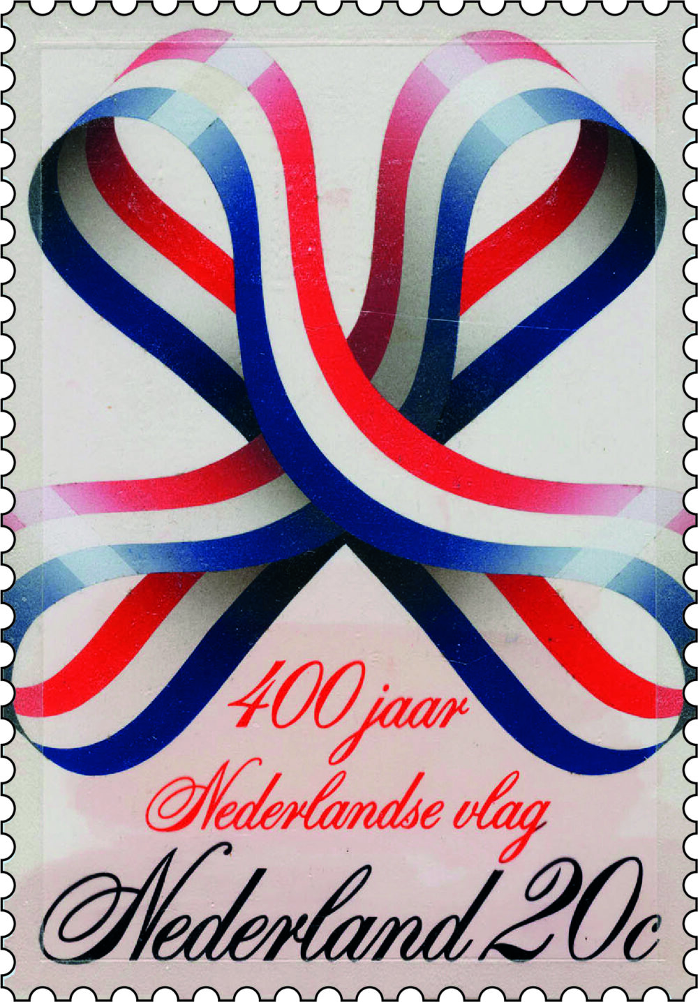
In eerste instantie was mijn uitgangspunt de vierhonderdste verjaardag als inspiratiebron. Een afbeelding van een verjaarsstrik zoals jarige kinderen die opgespeld kregen leek mij toepasselijk. Dat was mijn eerste ontwerp. Hein van Haaren van de Dienst voor Esthetische Vormgeving vond dat wat te frivool en raadde mij aan een serieuzer ontwerp in te dienen. Dat vond ik geen probleem.
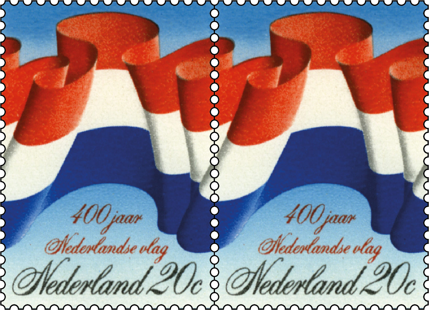
Mijn tweede ontwerp was geïnspireerd op de vlaggen die te zien zijn op middeleeuwse kunstwerken zoals bekend van b.v. de vader en zoon van de Velde die in de zeventiende eeuw zulke indrukwekkende zeegezichten en zeeslagen schilderden. De vlaggen wapperden uitbundig en wulps in een overdadig drama van golven, wind en wolkenluchten.

Hein van Haaren, Directeur van de Dienst voor Esthetische Vormgeving van de PTT, had voor deze opdracht een competitie belegd tussen Otto Treuman en mijzelf. Treuman was een gerenommeerde ontwerper met een solide reputatie en ervaring, en een aanhanger van het functionalisme. Op dat moment studeerde ik aan het Royal College of Art in London en werd meegevoerd in een maalstroom van een avant-garde die geen genade kende. Het doorgeschoten functionalisme werd met veel visueel geweld in de vangrail gedrukt door young professionals als Gert Dumbar, die het pad effende voor een illustratieve en speelse benadering.
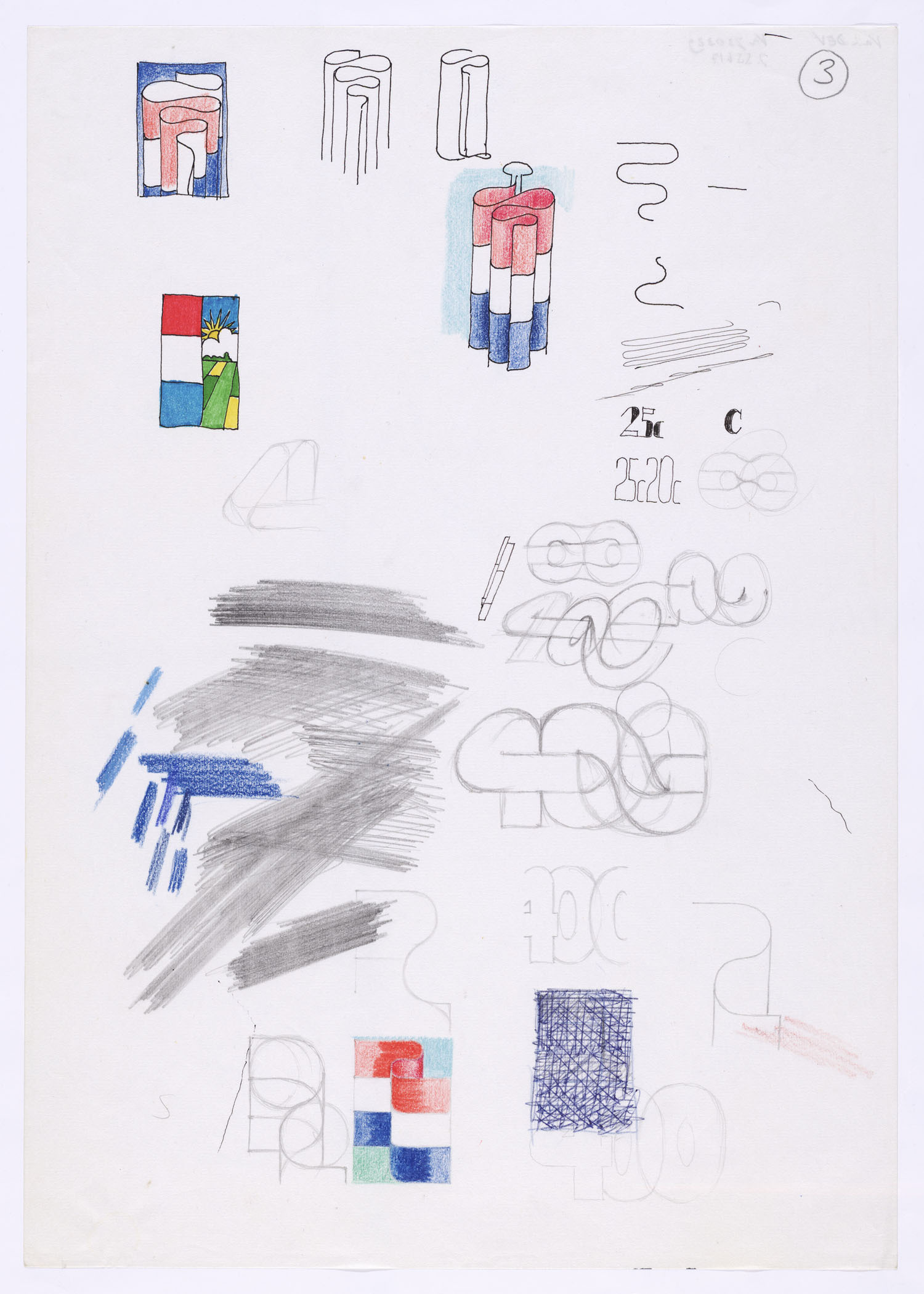
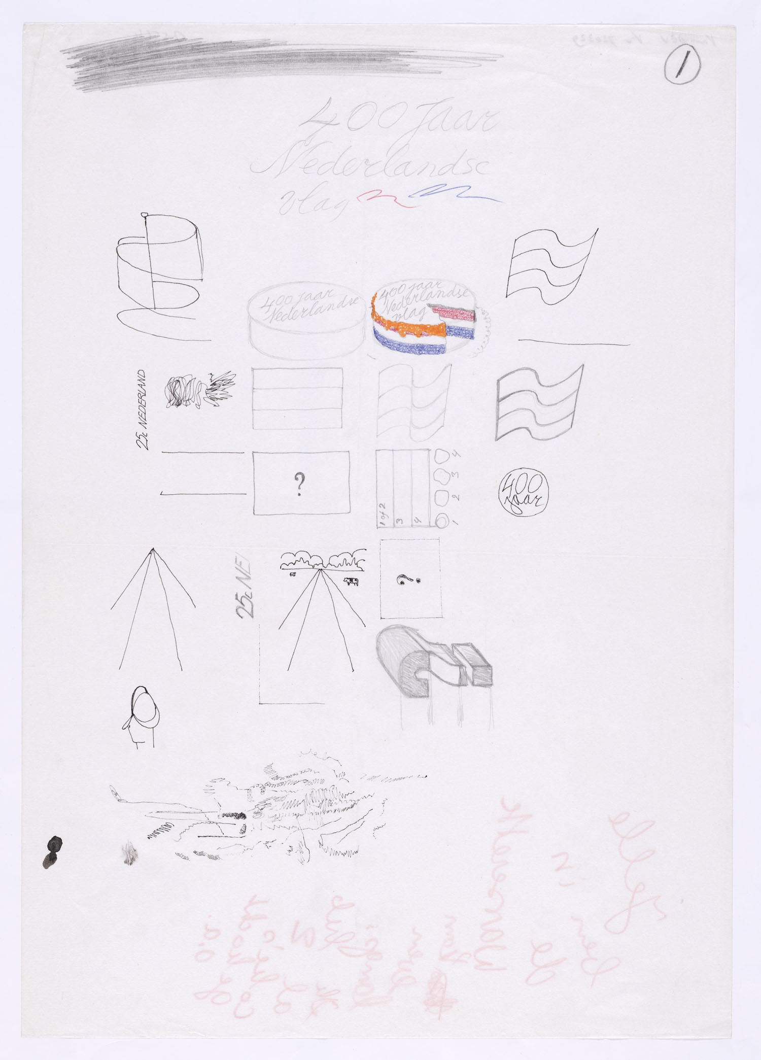
Mijn ontwerp was bijna kitsch met een bol wapperende vlag en een overdadig decoratieve belettering. Het kreeg de voorkeur boven het ontwerp van Treuman. Het is ook een van de eerste z.g. ‘doorlopers’, waarbij het ontwerp horizontaal doorloopt over de naastgelegen zegels.