Opdrachtgever: Ministerie van Onderwijs en Wetenschappen
Ontwerp & uitvoering: Jelle van der Toorn Vrijthoff met Frans Lieshout en team Total Design
In de zestiger jaren groeide de wens binnen de Nederlandse overheid om de verschillende ministeries te onderscheiden met eigen huisstijlen. Daarbij was de trend tevens om dat te laten doen door gerenommeerde ontwerpbureaus en niet door reclamebureaus zoals dat voorheen vaker het geval was.
Zo ook het Ministerie van Onderwijs en Wetenschappen kortweg O en W.
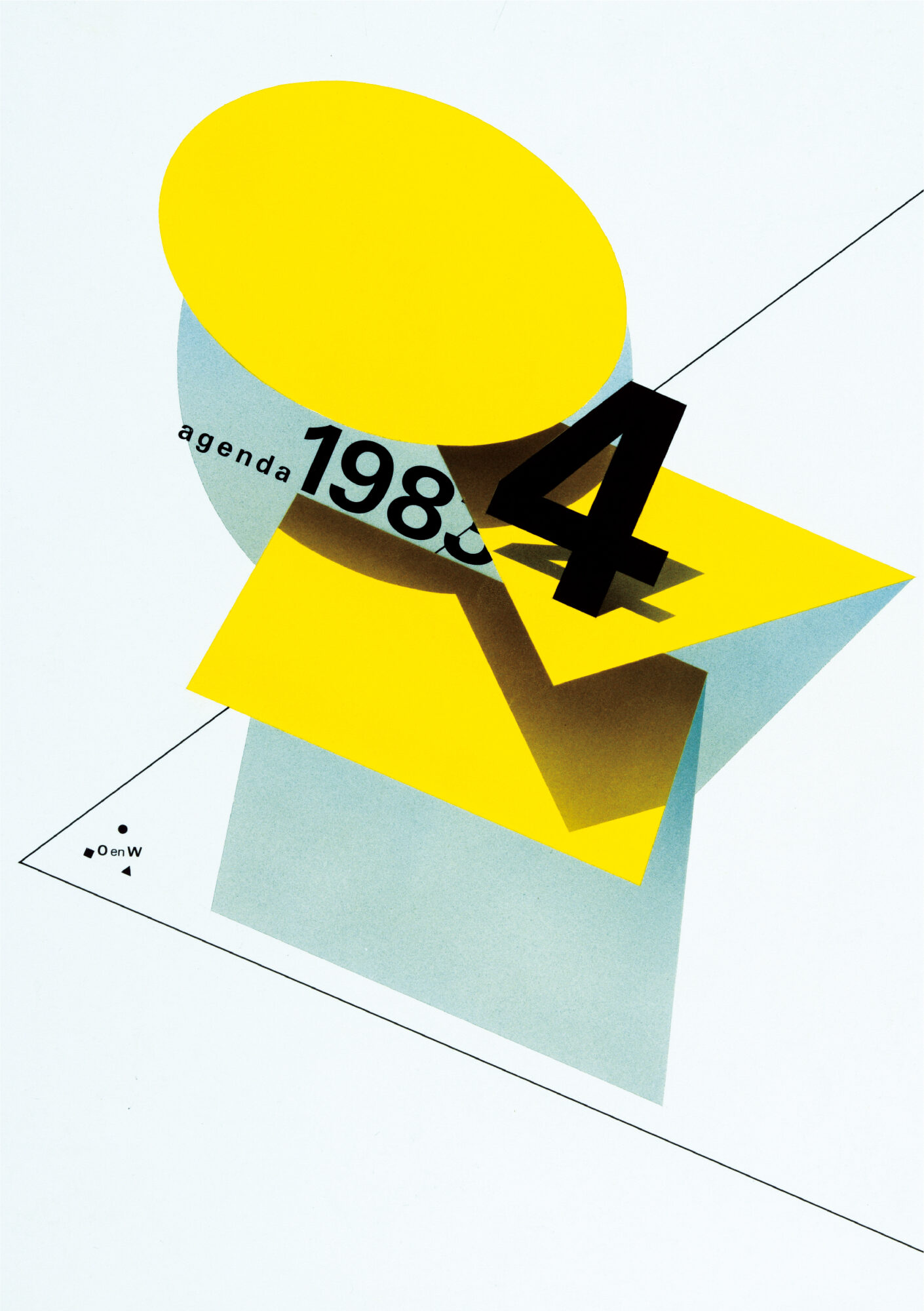
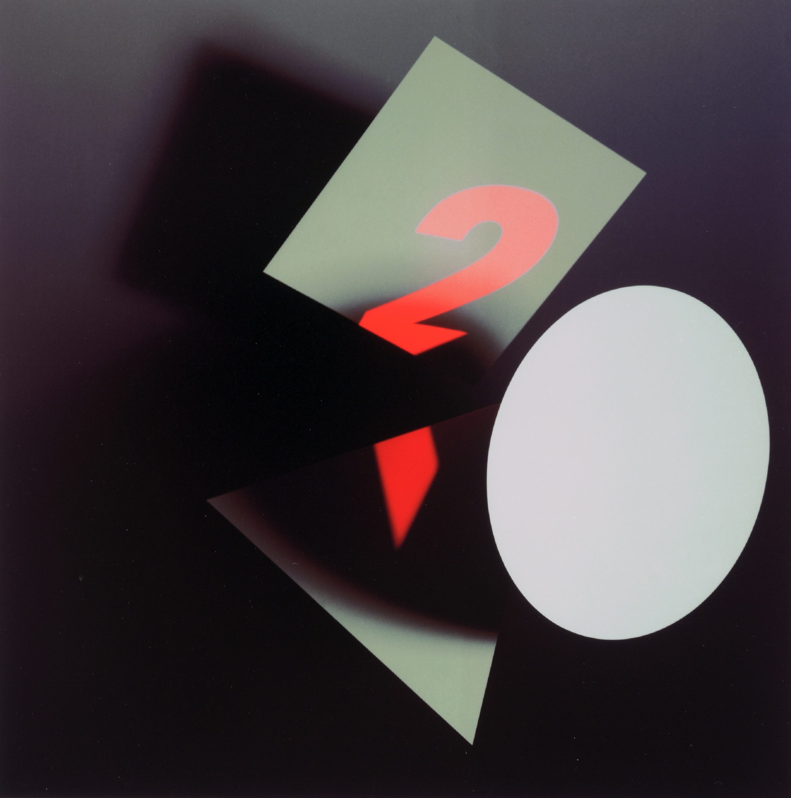
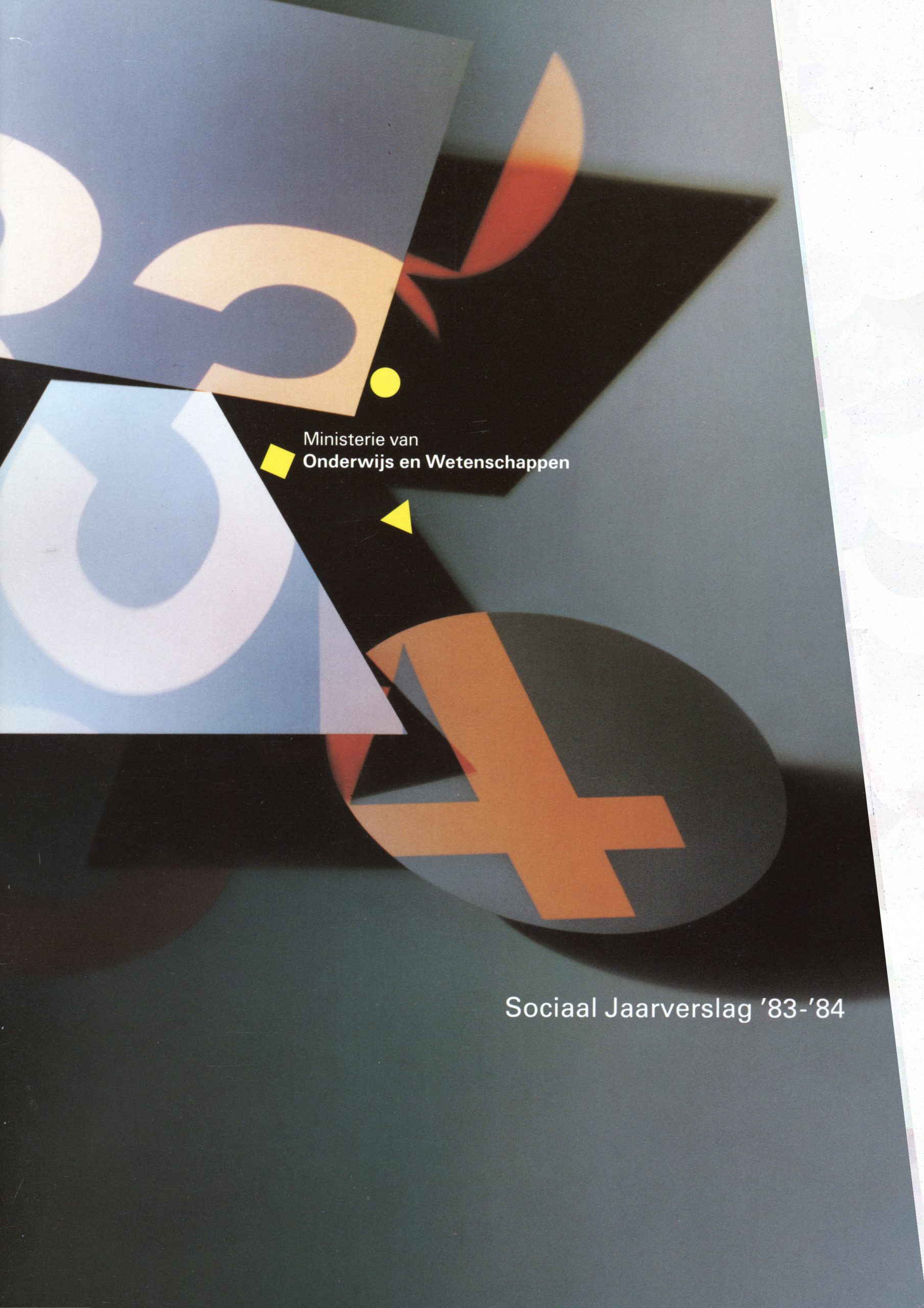
Total Design was in die tijd op weg om afscheid te nemen van de strakke, functionalistische en dogmatische werkwijze en zocht voor dit ministerie in het bijzonder een speelse en avontuurlijke vormgeving. Meer een receptuur van vormen en typografie die juist in een afwezigheid van strakke huisstijlregels tot zijn recht moest komen. Daarmee werd het meer een free-style concept dan een toepassing van regels uit een traditioneel handboek.
Een vrije toepassing van een basisgeometrie als bouwstenen in twee en drie dimensies, in fotografie, illustratie, architectuur en interieurontwerp zouden een herkenbare stijl opleveren. Het bleek niet voldoende te zijn. Veel ontwerpers die opdrachten uitvoerden voor het ministerie waren niet bij machte om de geboden vrijheid om te zetten in experimentele vormgeving.